AMANTI A MANO ARMATA









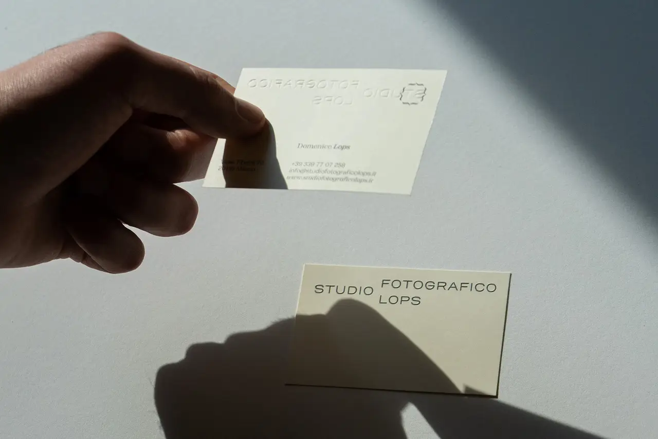
Since 1986 Studio Fotografico Lops has been translating the character of people into images and telling their stories. As early as the 1980s, Giuseppe Lops was among the first to favor a more spontaneous style and the use of natural light, bringing reportage into the field of wedding photography. This allowed the studio to become one of the landmarks of Milanese photography and beyond. Forty years later his son Domenico, with a broader photographic background, carries on the work begun by Giuseppe, following the canons of photojournalism and portraiture and expanding the services offered by the studio. In 2021, to enhance this generational change, we were commissioned to completely restyle the studio.